plan, execute, dominate
share

Tag Archive: Conversion

Five Ways You Can Maximize Your Great Blog Posts

Congratulations: your blog post has become very successful! People are reading it, commenting on it and sharing it with their friends on social media. It’s exactly why you hire blog writing services to help you with content in the first place. However, just because your blog post is popular doesn’t mean that it can’t be more popular.


eVisible provides article writing services for clients and helps them to take steps to seize the momentum of popular posts and make sure they are as effective as possible. Here are some steps to take once you realize that a post has the potential to be a hit:

higher_success

Refresh Your Content Regularly

Go back to your old content and see which posts were once popular but have stopped receiving a high number of hits. There’s a good chance that these posts have not been updated in quite some time. You can reverse this trend by freshening up your content with updates, new information or just formatting it to make it easier to share with hot social media sites. Doing this will almost always lead to an increase in views for old posts.


Use Your Sidebar Space

Almost every blog has sidebar space. Chances are that you use it for banner “ads” directing people to your events, special activities or other sections of your website. Why not also use this space to highlight your most popular posts? If people see that the most popular posts on your site are in one place, there’s a good chance they will click on them to see exactly why they are so popular.


Include Popular Posts In Your Email Marketing

Your most popular blog posts clearly have content that your customers will find engaging, so it makes sense to integrate them into other aspects of your marketing. When you perform a drip email marketing campaign, why not have some space within the message to highlight two or three of your most popular posts? It’s even better if these posts are relevant to the same topic as your email.


Collect Information In Exchange For Access

A popular post is a commodity that you can utilize — if done wisely. You may want to have pop-up come up over the text or graphics of the post and make it so that readers have to choose whether or not to sign up for your newsletter in order to read the rest. If you take this approach, it’s important that you also give readers a way to say “no thank you” and read the post without giving you additional information or signing up for a newsletter.


Repurpose Your Content Into a New Format

Putting old content into a new format is a great way to recirculate your popular material and get fresh hits. For example, a text-driven post that was successful two years ago might make a perfect infographic today. Or you might find content in a post that now makes more sense to be picture-oriented so you can share it through sites such as Instagram.


You can also extend your content by getting more in-depth than you did originally. Research suggests that content that is 2,000 words or more tends to rank better than content that is 1,000 words or less. You can also tweak your post headlines in order to utilize tips such as making them “how tos” or “lists” in order to get new eyeballs.

Increasing CTR Through the Use of Semantic Markups

Search marketing is about more than just achieving the highest page ranks for your web pages. Getting ranked on the first page of a Google search isn’t useful if a customer isn’t given a compelling reason to click on your link. This is one of the main reasons that doing semantic markups on your website is important even though they are not a ranking factor with Google.

A semantic markup is the adding of HTML markups to your web pages that give Google clues about the context of its content. In many cases, this takes on the form of rich snippets of text, photos and other information designed to give readers more information about what is on a particular web page and who is responsible for it. While it won’t result in a higher search engine results page (SERP) listing, it can play major dividends for your click-through rate (CTR). The reported increase in click-throughs for results with rich snippets is an average of 15 percent.

For this reason, adding semantic markups to your web is one of the steps that eVisible recommends for our clients. Our website development and consulting services go beyond just achieving better search results and focus on improving your ability to connect with new clients. Semantic markups are a great way to increase your visibility with little extra effort required.

If you are not doing semantic markups on your site, you need to start. Here are four of the most basic types of semantic markups that you should consider implementing right away:

semantice-web

Breadcrumbs

Think of breadcrumbs as a way to let web users quickly navigate your website. Instead of just your home page coming back in a result, end users can see links to very specific landing pages. This can direct them to the areas on your site you are most interested in showing off and cut down the amount of clicks between them and a sale.


Facebook Open Graph

An Open Graph markup allows you to connect your web pages to Facebook’s social graph. This means that you can control how your web page is displayed when a link to it is used on Facebook or other social media sites. You can create a headline specially designed for social media sites and choose which images will be used when your links are shared.


Rating and Review Information

Give potential customers an idea of what other people think about your business by including ratings and review information in the search results. The rich snippet information can also include the number of reviews – a higher number gives people more confidence – price levels and other product-specific information.


VideoObject Schema

People want to know more about videos that you create before they click on a search result to view them. Including a screenshot and some basic information (description, length, etc.) about a video in the search results can enhance CTRs.

Taking Human Nature Into Account Can Increase Conversion Rates

Website visitors react to what they see in very predictable ways. Study after study has shown that how a person encounters a website will have a significant impact on how they react to it. Even with the exact same content, one website layout can increase the chances of conversions while another can make the site more vulnerable to high bounce rates.


A good rule of thumb to follow throughout your entire website layout and design work is to focus on what you want people to do on the page. A big part of conversion rate optimization is to understand the purpose of the page and getting people to have a laser-like focus on the page elements that will push them to do the task you want them to do. Whether it’s signing up for more information or making a purpose, every element on the page should drive a visitor to do just that.


human-touch


So how do you do this? Here are just a few of the ways that you can increase your likelihood for conversion rate success:

Limit Choices: Too many choices can leave website visitors paralyzed by options, so they wind up doing nothing. Instead of giving visitors multiple different forms to fill out, limit them to one choice. Instead of having all of the different social media sites listed with sharing buttons, limit the page to the few sites that make the most sense for your customers.


Top to Bottom, Left to Right: People read websites like they read newspapers. This means they expect the most important information to be “above the fold”, i.e. above the first half of the page. They also are used to reading left-to-right, which means that you want to make sure that valuable information is on the left side of the page. Keep calls to action and other secondary content on the bottom half of the page. If a person scrolls to this part of the page, chances are that they are ready to take the next step.


Headline Sizes Matter: People are attracted to big, bold headlines that spread across the screen from the top of the page. Design your site so the most important information is encapsulated within a headline at the top of each page.


Use Images: Especially of people. Studies have shown that website visitors react particularly strongly when they see pictures of people on a website.


Think About Usability: If a person can’t navigate your website, they’ll click away rather quickly. Avoid this by utilizing a clean layout with a solid color contrast, plenty of white space and an avoidance of overstuffing the pages with too much clutter.


Keep Ads and Sidebars Away From Main Content: Whether you are selling ad space on your site or have internal links to other pages on your site, you want to keep these elements apart from your main content. Have a clear delineation between the main content and any sidebar content that might pull people away from your main message.

You Won’t Believe the Ways We Know to Make a Powerful Headline

Creating a powerful headline is important — maybe even more important than you think. According to recent research, 80 percent of people will read a headline on a website, but only 20 percent of these people will actually read the article. The quality of the headline can make a big difference between the articles that are read versus the ones that aren’t.

So what makes a compelling headline? The team behind eVisible content writing services knows that there’s no “magic bullet” to assure that headlines will grab your readers’ attention. You’ll need quite a bit of trial and error to discover the type of headlines that will resonate with your target audience but doing it properly can pay significant dividends.

powerful-headline

Don’t Be Afraid to Get Creative: A boring headline — even if factually accurate — isn’t going to drive people to your content. Any fears about using clever or “cute” headlines to draw in readers have been proven to be outdated with the rise of viral sites that get huge click-through and page view numbers with creative and witty headlines.

Consider Your Target Audience: It’s important to think about who you want to read your stories and what you want them to do when crafting a headline. If you are looking at closing sales, you need a headline that calls the reader to action. If you are simply looking to increase page views, you need to focus on grabbing their attention with the promise of something unique in the story text.

The Medium Matters as Well: You need to consider who your readers will engage with the headline when creating it. Sites such as Facebook allow you to use an image and, possibly, some additional “teaser” text as a sub-headline to attract a potential reader’s attention. Make sure you take advantage of these opportunities when you can.

Remember That People Are Curious By Nature: There are several types of headlines that have become popular in recent years:

  • Lists
  • Questions
  • How-Tos
  • Directly Addressing the Reader

But one of the most popular recent trends has been in headlines that use shocking language, over-the-top statements or emotional responses to get readers hooked. This is particularly true of viral news sites, which often use headlines such as “This Picture Shows Why Our Education System is Doomed” or “You Won’t Believe Why This Woman Was Sent to Prison for 20 Years.” They present bits of information that connect with people’s emotions and lead them on to want — and almost need — to click through to find out more. It’s powerful, effective and is a method that can make your articles go viral.

Steps to a Solid eCommerce Checkout System

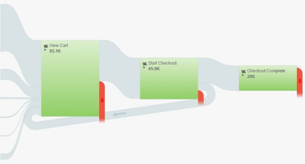
One of the easiest ways to make more money from your online business is to improve the flow of your eCommerce checkout system. You need to make it as easy as possible for people who are browsing for products on your site to make a purchase. There are many ways to improve this flow rate, but even a slight improvement in conversion rate optimization can lead to a significant increase in profits.

The specifics of how to improve your conversion rate will be unique to your website. You’ll need to do conversion testing and reporting to fully understand what it means for your site. But what motivates a person to decide to make a purchase from a website is universal. Roughly stated, a person makes a purchase because they are motivated to buy a product, have the immediate ability to make a purchase and have been “triggered” to buy.

solid-checkout-flow

Getting people motivated and triggered to make a purchase can be as simple as sending out an email and having them click through to your product page. But it takes professional website development in order to give a customer the easiest path to purchase. One secret is to make sure that a customer gets an item into their shopping cart as quickly as possible. This gets them out of the mindset of “just browsing” since they are now officially “shopping.”

It’s important to make it as easy as possible for a person to add something to their shopping cart. The purchase button should be as big and obvious as possible. Once a person adds something to the shopping cart, it should be clear that they have something in the cart. And you need to make sure that the customer can see how to go to the shopping cart to enter in their payment information and complete the purchase at any time.

From a web design standpoint, you also need to consider what happens when a customer gets ready to make a purchase. One consideration is whether or not you require customers to register before buying anything. As a general rule, forcing customers to register creates a barrier that could very easily lead to them not making a purchase. You’ll also want to make sure that you don’t ask for credit card information until the last step in the process. Get all of the shipping and personal information first so that the credit card information is easy to get.

These are just a few of the things that you’ll want to do when you think about your eCommerce set-up. eVisible can help you design an eCommerce system that is right for your industry and business.

Five Public Relations Tools to Boost Your SEO

When most people think about how public relations tactics can help their SEO campaigns, the first thing that comes to mind is to write press release. While it’s true that well-crafted, keyword-rich and interactive news releases crafted by press release writing services can help your SEO and your marketing efforts, press releases are far from the only public relations tactics that can boost your search engine rankings.

public-relation-boost-seo

Some of these tactics involve establishing your company as an authoritative brand within the space; others involve marketing efforts that also benefit others. All of these tactics can help you generate publicity and help with your SEO:


Make Charitable Contributions: Being a good corporate citizen serves several purposes. A donation to a worthy charity helps people in need and can be a tool for your own promotion. Work with the charity to promote your donation. You can get creative and come up with a charity angle that is unique and will attract media attention.


Hold Unique Contests: Running a contest like a scholarship essay competition or product giveaway serve several purposes. They can generate social media links to serve as social signals; they can provide drive brand awareness; and they can provide reasons for media stories that will also boost your SEO. Making the contests unique and interesting — such as a food eating contest — helps.


Be a Guest Contributor: Pitch the executives at your company as “guest contributors” to local, national and industry media outlets and blogs. If customers read intriguing content with their names attached to it, they will think of them — and your brand — as thought leaders in the field. You can use ghostwriters for the content if needed and attach a name later.


Serve as Guest Talent: Many industries have TV or radio shows specific to their market. Get your executives to appear on these shows. It will help your brand and create links from the shows’ websites that will boost your SEO.


Speak at Industry Events: Getting your executives in front of convention attendees is a great tool for increasing visibility and creating links. You can host your own event as well.

Five Easy Steps for Turning Visitors Into Customers

One of the most important but often overlooked parts of any SEO campaign is landing page optimization. This is the process of making sure that your landing pages – i.e. your home page and other key pages on your site – are designed for SEO success as well as to convert visitors to customers. You can see why this is so important – after all, what is the point of getting customers to your home page if they are going to leave your site before they buy anything?

convert visitors into customers

Even though it’s apparent that increasing your landing page conversion rate is critical to the success of your site, not everyone knows how to do this. To help you out, we’ve compiled five easy steps to help turn curious site visitors into happy customers:

Customer Validation: Potential customers want to see that people just like them have had positive experiences with your products or services. You can let your past sales work for you by aggressively seeking testimonials from your customers and posting them prominently on your website.

Make Customers Feel They Are Missing Out: The “herd mentality” is a real thing when it comes to online marketing. Customers are more likely to purchase your product if they feel like other people are doing the same thing. Call if safety in numbers or not wanting to miss out on the next big thing. You can play to this by showing how many people have recently purchased or tried out your product or offering.

Customize Your Pitch: Customers want to feel like they are special and not just one of the many people receiving a sales pitch. There are many ways that you can customize your sales pitch to reach out to customers on an individual basis. You can use software to insert a person’s name or hometown, or send a different pitch to male or female customers.

Keep Access Limited:  What’s the best way to get people curious about something? Keep it hidden from them. You can do this with your online content as a way to get customers interested in what you are offering. Give them a little taste of some interesting content but ask them to send their email address to you in order to read the rest.

Speed Matters: Don’t overlook the speed of your website. If your website is slow to load, potential customers might give up and go to a different site.

Five Ways to Balance Your Website’s SEO and Usability

Using SEO tactics to get customers to your website is great. After all, people need to find your site in order to use it. Companies know this – it’s why many spend significant amounts of time and resources on professional search engine marketing. However, getting people to visit your site is only part of the battle. If the content is weak or poorly written, or the layout is distracting and confusing, what is the point?

It’s easy for a web development consultant to spend so too much time worrying about SEO considerations and not enough thinking about customer usability; this often leads to websites that rank highly with search engines but have low conversion rates when it comes to translating web views into actual sales.

seo and usability

Don’t fall victim to this short-sighted approach to web development services. Instead, utilize these five tricks that will help boost your search engine rankings while also improving the interface and user experience for your customers:

Know Your Customer: There’s no such thing as the “typical” customer. But by doing some market research. you can understand what drives a potential customer in your category to make a purchasing decision. Remember that a website that works for one type of business might not be appropriate for another business.

Make Your Content Have a Point: The content on your website isn’t just there to fill space or serve as filler between optimized keywords. Think about the types of questions that you customers might have and design your text to clearly answer these questions.

Keep Graphics Simple and Clean: It’s easy to try and go overboard with graphics, colors and other design elements with laying out your website. After all, you want your site to be memorable and eye-catching. But in many cases, this means that your website will also be distracting and keep people from finding the links and information they need to make a purchasing decision.

Make Navigation Easy to Follow: One of the main reasons that people leave a website before making a purchase is because of poorly development site navigation. If they can’t easily find a link to the information they need, they’ll likely leave and try out a competitors’ site. Check your website design and make sure that customers can quickly get to the pages that lead to sales.

Track and Change: The work isn’t done when your website goes live. You need to track visitors, clickthrough rates and sales to determine what does and doesn’t work and make changes quickly if necessary.