plan, execute, dominate
share

Category Archive: Analytics

Steps to a Solid eCommerce Checkout System

One of the easiest ways to make more money from your online business is to improve the flow of your eCommerce checkout system. You need to make it as easy as possible for people who are browsing for products on your site to make a purchase. There are many ways to improve this flow rate, but even a slight improvement in conversion rate optimization can lead to a significant increase in profits.

The specifics of how to improve your conversion rate will be unique to your website. You’ll need to do conversion testing and reporting to fully understand what it means for your site. But what motivates a person to decide to make a purchase from a website is universal. Roughly stated, a person makes a purchase because they are motivated to buy a product, have the immediate ability to make a purchase and have been “triggered” to buy.

solid-checkout-flow

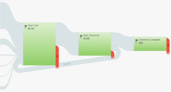
Getting people motivated and triggered to make a purchase can be as simple as sending out an email and having them click through to your product page. But it takes professional website development in order to give a customer the easiest path to purchase. One secret is to make sure that a customer gets an item into their shopping cart as quickly as possible. This gets them out of the mindset of “just browsing” since they are now officially “shopping.”

It’s important to make it as easy as possible for a person to add something to their shopping cart. The purchase button should be as big and obvious as possible. Once a person adds something to the shopping cart, it should be clear that they have something in the cart. And you need to make sure that the customer can see how to go to the shopping cart to enter in their payment information and complete the purchase at any time.

From a web design standpoint, you also need to consider what happens when a customer gets ready to make a purchase. One consideration is whether or not you require customers to register before buying anything. As a general rule, forcing customers to register creates a barrier that could very easily lead to them not making a purchase. You’ll also want to make sure that you don’t ask for credit card information until the last step in the process. Get all of the shipping and personal information first so that the credit card information is easy to get.

These are just a few of the things that you’ll want to do when you think about your eCommerce set-up. eVisible can help you design an eCommerce system that is right for your industry and business.
Five Ways to Balance Your Website’s SEO and Usability

Using SEO tactics to get customers to your website is great. After all, people need to find your site in order to use it. Companies know this – it’s why many spend significant amounts of time and resources on professional search engine marketing. However, getting people to visit your site is only part of the battle. If the content is weak or poorly written, or the layout is distracting and confusing, what is the point?

It’s easy for a web development consultant to spend so too much time worrying about SEO considerations and not enough thinking about customer usability; this often leads to websites that rank highly with search engines but have low conversion rates when it comes to translating web views into actual sales.

seo and usability

Don’t fall victim to this short-sighted approach to web development services. Instead, utilize these five tricks that will help boost your search engine rankings while also improving the interface and user experience for your customers:

Know Your Customer: There’s no such thing as the “typical” customer. But by doing some market research. you can understand what drives a potential customer in your category to make a purchasing decision. Remember that a website that works for one type of business might not be appropriate for another business.

Make Your Content Have a Point: The content on your website isn’t just there to fill space or serve as filler between optimized keywords. Think about the types of questions that you customers might have and design your text to clearly answer these questions.

Keep Graphics Simple and Clean: It’s easy to try and go overboard with graphics, colors and other design elements with laying out your website. After all, you want your site to be memorable and eye-catching. But in many cases, this means that your website will also be distracting and keep people from finding the links and information they need to make a purchasing decision.

Make Navigation Easy to Follow: One of the main reasons that people leave a website before making a purchase is because of poorly development site navigation. If they can’t easily find a link to the information they need, they’ll likely leave and try out a competitors’ site. Check your website design and make sure that customers can quickly get to the pages that lead to sales.

Track and Change: The work isn’t done when your website goes live. You need to track visitors, clickthrough rates and sales to determine what does and doesn’t work and make changes quickly if necessary.

Six Forgotten Web Analytic Points That Can Make or Break Your Campaign

One of the most difficult parts of a website optimization campaign is analytics. With many data points to choose from when looking at your landing page optimization campaign, it’s easy to overlook some of the most important elements. Here are six analytic points you need to pay attention to:

Entry Pages: A lot of emphasis is placed on home pages in website analytics. But landing pages and product pages are also critical to the success of your site. One of the best things to analyze on an entry page is the last action a person took before leaving. It might tell you what was frustrating on the site and caused them to quit.

Meeting Sales Goals: The main goal of almost any website optimization campaign is to increase landing page conversion and turn clicks into sales. But too many people get bogged down in the minute details of their web campaign and lose focus on tracking their sales performance. Most solid analytics tools have the ability to set and track eCommerce goals.

web analytics

Web Form Stats: Your web forms are critical to your landing page conversion rate. Whether its customers asking for more information on your services or a shopping cart or payment page to complete a transaction, you need to know if customers are filling out forms once they get to the final step in the process.

Search Keywords: Finding the right keywords to focus your optimization efforts is a critical aspect of your SEO campaign. Before you do this, you’ll want to see how people are finding your site now. If the majority of customers found it by searching for your “brand name,” you aren’t doing enough to attract new customers. More generic keywords will be effective search keywords to optimize.

Traffic Sources: It’s easy to become so wrapped up in detailed web analytics and forget about one of the most basic pieces of data: where your web traffic is coming from. Determining if visitors are coming because of web searches, referrals or ad campaigns will help you understand which tactics can potentially have the best results.

Actual Website Traffic: Did you know that many website visits aren’t from real customers but from search engine robots and spiders that crawl Internet sites regularly? Most web visits that last 10 seconds or less are useless to you. Focus on lengthier visits to get a more accurate reflection of your web campaign.